


I have always been enamored with black and white photography. When one looks at the majestic prints of Ansel Adams with impeccable tonal and contrast qualities, or the provocative messages of Diane Arbus, Julia Margaret Cameron and Margaret Bourke-White, and certainly the masters of Bresson, Strand, Steiglitz, Cunningham to name a few I'm often struck with the question-How did they do that? For it's not just the compositional element of their photographs that one looks at but the sharpness and clarity of the print.
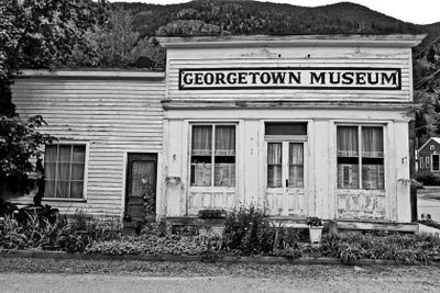
The images that I have presented here were all shot in color and converted on the computer. While I "grew up" in the darkroom, I don't have the time nor the equipment to produce a true black and white print. I was able to do some black/white shooting with my Pentax 6x7 last year but again am limited by time to getting to the lab at my college to develop. Some of the images you may be thinking; reek for color, however, I assure you that if you look at the tones and contrast you'll actually "see" the color in them.
I often wonder if these noted photographers would be "turning over in their graves" to know this is being done now or would they embrace the technology and use it to their expertise. One can only speculate on this.
2 comments:
Wow, by being black and white it seems to bring out 'contrast' or starkness somehow, like the viewer suddenly focuses(?) more and actually opens themselves up looking for more detail or depth, evoking memories from their past and emotions thought controlled. the crown candy pic especially. at first just an everyday street scene but brought to such sharpness it hurts and makes me weep [in a good way :) ]
Thanks John for the nice compliments. The Crown Candy image is actually 3 images merged together and then the sky was added. It was originally done in color then converted to black/white.
Post a Comment